1. Alt text
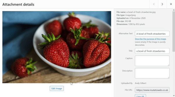
‘Alt text’ is also known as ‘alt tags’ or even ‘alternative text’. It is there to provide support for images. It provides a textual representation of the image if it fails to load. This could be due the image being missing from the server, a glitch while loading the image or may be a typo in the image reference. In the world of accessibility, the screen reader uses it to describe the image giving context to those users who would otherwise miss it. So, if the photograph shows a bowl of strawberries, say that, and as an extra bonus it helps improve your sites SEO! Also remember to give the image filename a descriptive name so that the search engines can pick up on that too for even more SEO points!
This is one of the WordPress’s image editing screens. They do vary depending on how you access them, but this screen will do, for what I want to show you with this top tip. When you first access this screen the title will be taken from the filename, but the Alternative Text field will be empty and it is here that you add a relevant description of the image. Make sure it describes the image in a way that if the image wasn’t there, you would know what should be there.
2. Colour and contrast
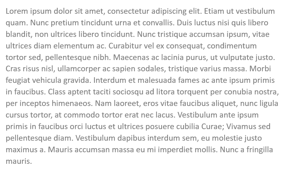
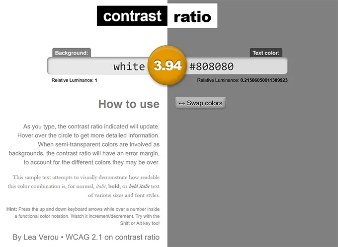
There has been a trend over the last few of years to use grey text where previously the default was to use black text and as the grey gets lighter, the contrast reduces. The guidelines require a contrast ratio of 4.5:1. How do you measure this? One site is contrast-ratio.com where you can enter 2 colour values and get a contrast score (the example fails with 3.94 ratio).
3. Avoid automatic media
Have you ever landed on a page to discover that a noisy video or audio track has started to play, making you jump and panic search for the stop or mute button? Users with good sight can often struggle to find the button, can those same users imagine what it is like for visually impaired, screen reader or keyboard users. Don’t do it! Always provide a way for the user to choose how to start the action.
4. Descriptive links
We’ve all come across them and I’ve certainly written a few in the past, links with ‘Click here’ or just ‘here’ as the only link text. What does this mean to a screen reader user?
Which of these two lines would encourage you to action the link and go through to the next page?

5. Structured headings
Another key task to making your site accessible is to structure your headings. Doing this will make your content much easier to understand, digest and improves the flow.
Clear headings also help screen readers interpret your pages. This makes it much easier to provide in-page navigation. It’s also simple to do as you only need to ensure you use the correct heading levels in your content.
The following screen dumps are taken from the WordPress default editor, there’s a high chance that your page editor may look different, especially if the site uses a page builder plugin, but it will illustrate the point.
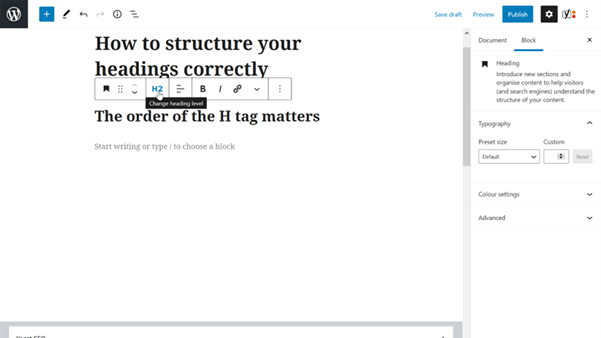
For instance, you should only use one H1 heading per page – usually as the page title.
This can be followed by subheadings starting with H2, which can then be nested further with H3, followed by H4 all the way down to H6. These should always be used in order so you should avoid using an H4 directly after an H2 (and so on). Here you can see an H2 heading in WordPress and how you could change it to a different level.
Do not be tempted to use the H setting for styling purposes, this should be controlled by the stylesheets (CSS).
6. Is your website legal
Is there a privacy notice and is it correct? Is there a cookie policy and a method of the visitor opting out of non-essential cookies? Do your contact details appear on the site? It’s a legal requirement for UK companies, partnerships and sole traders and should include:
Limited companies:
- Registered Company name.
- Company registration number.
- Company place of registration (e.g. Scotland or England & Wales).
- Company registered office address.
- If the business has a VAT number, it should be stated – even if the website is not being used for e-commerce transactions.
- If the business is a member of a trade or professional association, membership details, including any registration number, should be provided.
- Prices on the website must be clear and unambiguous. Also, state whether prices are inclusive of tax and delivery costs.
Sole traders and partnerships:
- In the case of a sole trader, the individual’s name.
- In the case of a partnership, the name of each member of the partnership.
- In either case, in relation to each person named, an address at which the business can be contacted and have legal documents formally served on it.
- If the business has a VAT number, it should be stated – even if the website is not being used for e-commerce transactions.
7. Are your payment card details up to date with your domain registrar?
In the last five days I have seen two websites fail because the payment cards details had run out. Domains are generally registered for two years and in that time it easy for the card details to expire, most registrars will notify you by email when this happens, but these email could end up in your spam box, ignored as not thought of as relevant or just put off for another day until it’s too late. Not only will you lose your website, but your emails will also fail and your search engine ranking will plummet. Keep those car details current.
 From the Domain, Education & Email categories
 Improve your professional standing
The domain you use for your business emails, tells how much your care about your digital communications. A generic, gmail.com, hotmail.com or live.com just lacks the professional touch your business needs. Register a domain that fits your business and use that to standout.


